At one point or another we’ve all had the fear.
The fear that a sticky toffee pudding may not be as good as our own recipe, or that one we had in a restaurant one time.
The shopping aisles are full of lots of sticky toffee puddings – but which one do you go for? Which one isn’t going to let you down and fill you with mistrust & misery?
It’s probably going to be one that looks good from the out-set.
‘Look, but don’t touch’ is a mantra adopted by many mothers trying to stop their fussing little one from pawing every piece of packaging in the shop. But what attracts those little hands in? Is it the bright colours? The shiny-ness? or the ability to do just what they intended– reach out and touch. With a die-cut shape in your packaging, your customer can do just that. They can see how great your product looks, and if they really want to I guess – have a feel (they might get a few dodgy looks though).
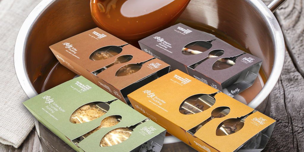
Some packaging we printed recently was for the Bowness Pudding Co and designed by those seriously smart folks at The Brand Chap. Firstly, if that name doesn’t let you know you’re in for a good pud then I don’t know what is. Based in wonderful Windermere in the Lake District, Paul Johnson a much-accomplished chef came up with the perfect recipes for all the family favourites – sticky toffee pudding, sticky banoffee pudding sticky Belgian chocolate pudding & sticky apple crumble. Each pudding is made from local Lake District produce and free of additives and preservatives – making the gluttony just a little bit guilt-free.
The die-cut of the spoons is unique – we’ve definitely never came across it in all our 40 years in business. It almost makes you want to dive in with nothing but a few spoons and your family. The die-cut has the customer drooling before they’ve even had a bite.
At PPP we can die-cut any shape you’re after, be it spoons, forks or an entire cutlery set. Whilst we explained in 3 short reasons why window-patching is a good idea for your packaging, differentiating with a die-cut is definitley close competitor.


