Behance is a great source for any designer or brand looking for a little bit of inspiration. So we scoured Behance for the most BOO-tiful and Spook-tacular packaging designs we could find, and we’ve left them right here for you to have a look. Expect more puns, exciting ergonomics and just damn good design.
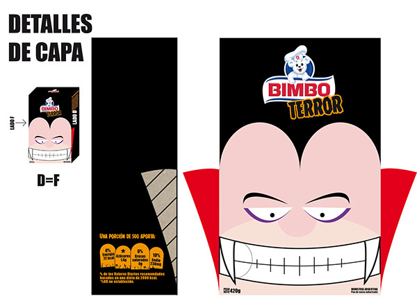
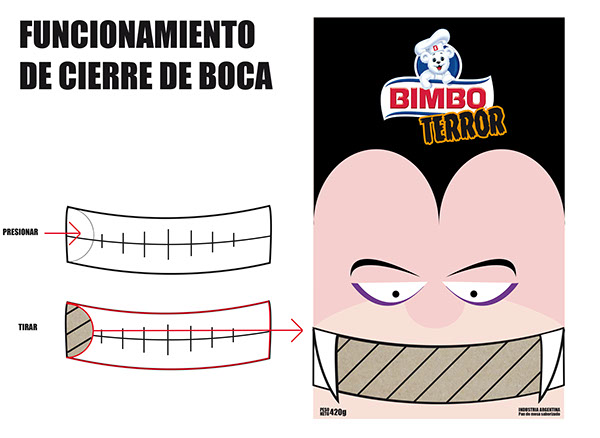
1. Count Dracula makes his debut
We have no idea what the ‘Bimbo’ brand is, – its kind of terrifying looking on its own, but we do love this packaging idea. Although we can’t speak Spanish, we’re pretty sure the text means ‘The function of the box’, and it has two options. Two garbage-style chute doors open from the side of the box to make his cape, allowing you to access the contents inside. Alternatively, you can get to the goodies by ripping his mouth (slightly sinister) and the goodies will drop from the box as a dispenser. Which one do you prefer?
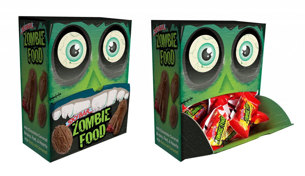
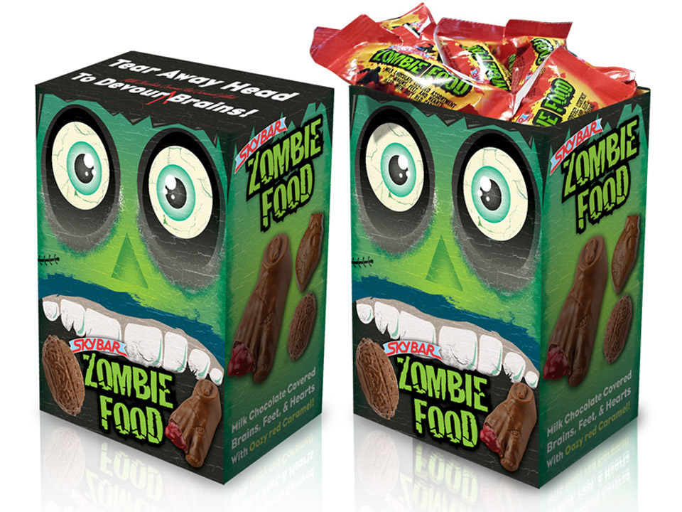
2. Exhilarating Zombie Snacks
Hmm, we’re not entirely sure how we feel about finger-shaped chocolate bars with blood like ‘red caramel’ inside. But we are SO sold on the packaging. This is another great example of ergonomics at its best by integrating the graphic design and structural design to work together in tandem. You can open Mr Zombies mouth to retrieve the finger snacks, or you can rip off his head – whatever tickles your fancy.
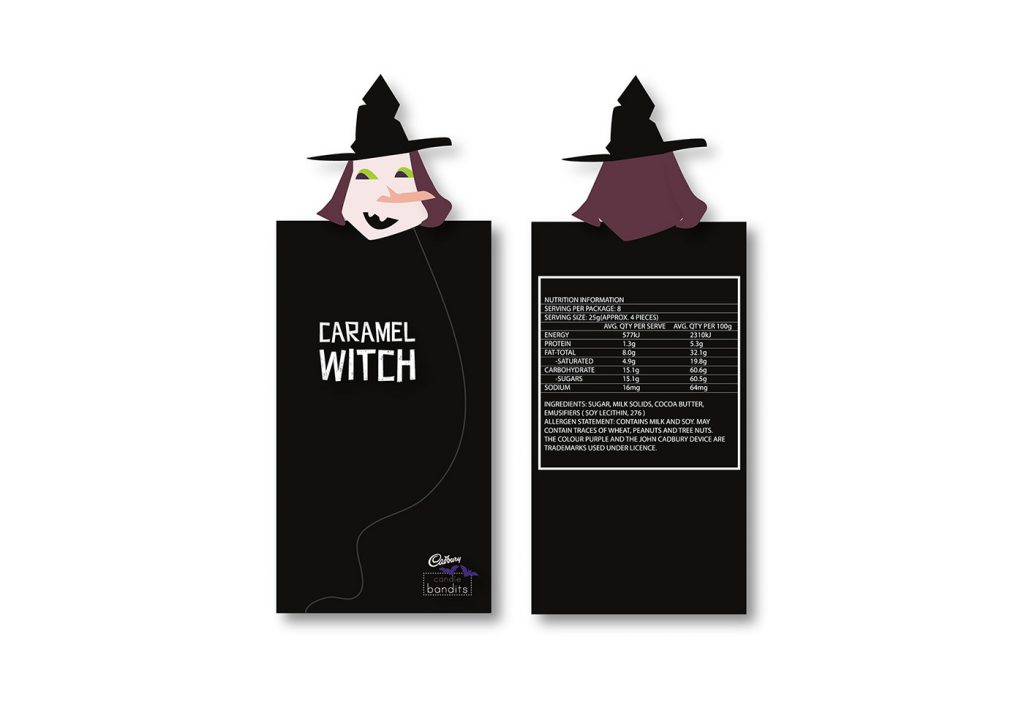
3. Bewitching Chocolate Bars
Honestly, we’ve been wondering what a caramel witch would taste like so we’re glad someone finally came up with the concept. All jokes aside, we love this simple idea to enhance this chocolate bar, achieved by a custom die-cutting forme. We also love that it’s been printed double sided so that there’s still some surprises on the inside, apart from the delicious chocolate – obv.
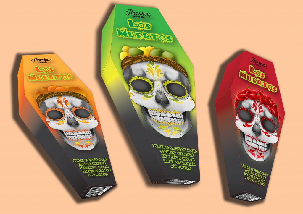
4. Life is like a coffin full of chocolates…
… you never know what you’re going to get. Unless of course you read the front then you’ll see they’re Thorntons milk, white and dark chocolates. We love this ‘Los Muertos’ chocolate coffin packaging. It’s actually just a brief, not a full blown product – but we love it all the same.
5. Food to Ghoul!
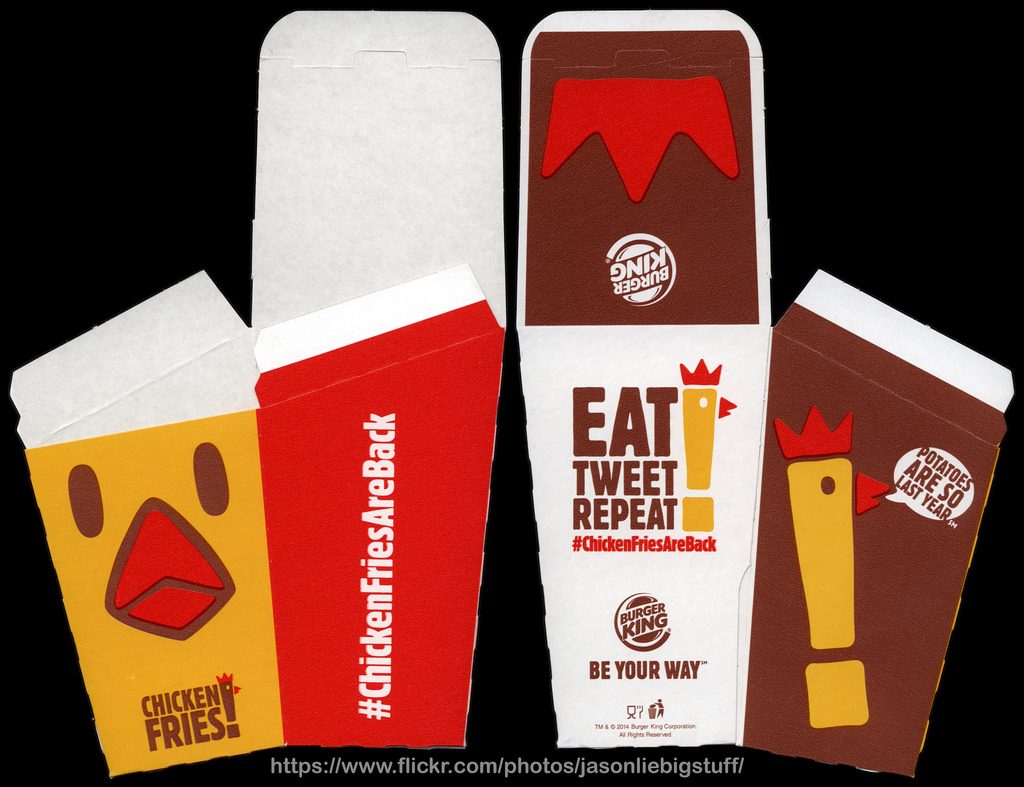
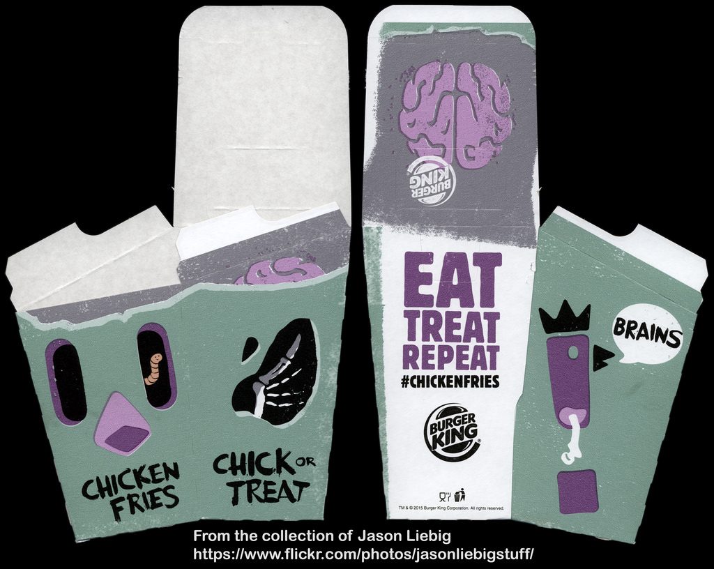
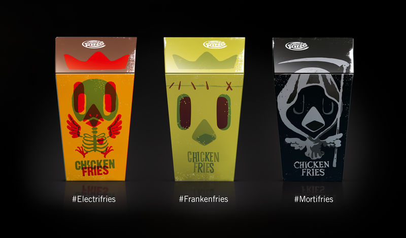
Oooooerrrr, we’re loving a bit of Food to Go packaging ourselves at the minute so we couldn’t help but get excited when we saw these Burger King mockups. Whilst nothing crazy has been done, the designer has clearly played on the ‘Chicken Fries’ product, and isn’t ‘Chick or Treat’ just a wonderful pun? We approve. The original design has been ‘Halloween-ified’ with the original very much alive chicken turning into a very sad deceased one with a worm popping out of its eye. Morbid? Very much so, but good design makes us feel kind of chirpy.
6. Spooky Snack Packs
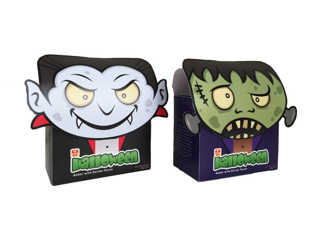
In design, there is always the knowledge that you have to work with what you’re given. In this case its two absolutely huge lapels that protect the products inside. So what are you gonna do with them? Make them Halloween themed of course. Dracula’s back, and Frankstein joins in to be the cover girls of these foreign producer snack packs. Don’t they look Fang-tastic?
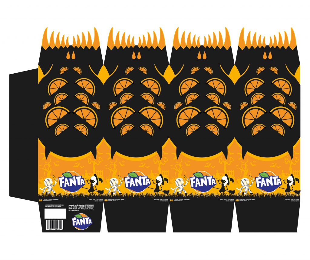
7. Fanta Claws
There is nothing scary about Fanta – unless you look at the sugar content. Nope, generally Fanta is pretty harmess.
This designer however thought it would be a good idea to make Fanta a little more Halloween-y.
When this bottle box holder is folded, it forms an endless optical illusion of orange claws. It even looks a bit like that monster from Stranger Things, but considering this packaging concept was developed all the way back in 2016 – Fanta couldn’t possibly have known that Stranger Things would become such a hit in the future. Spooky.
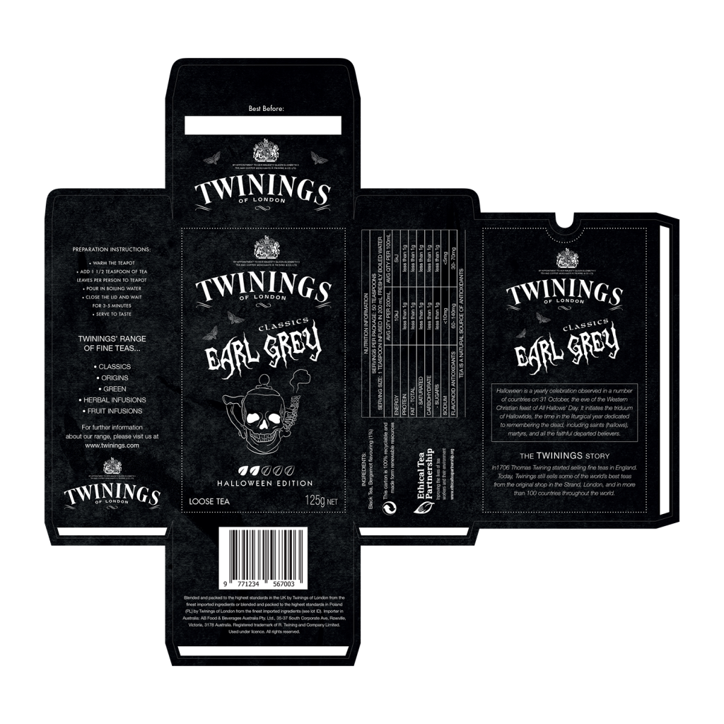
8. Terrifying Twinnings Teabox
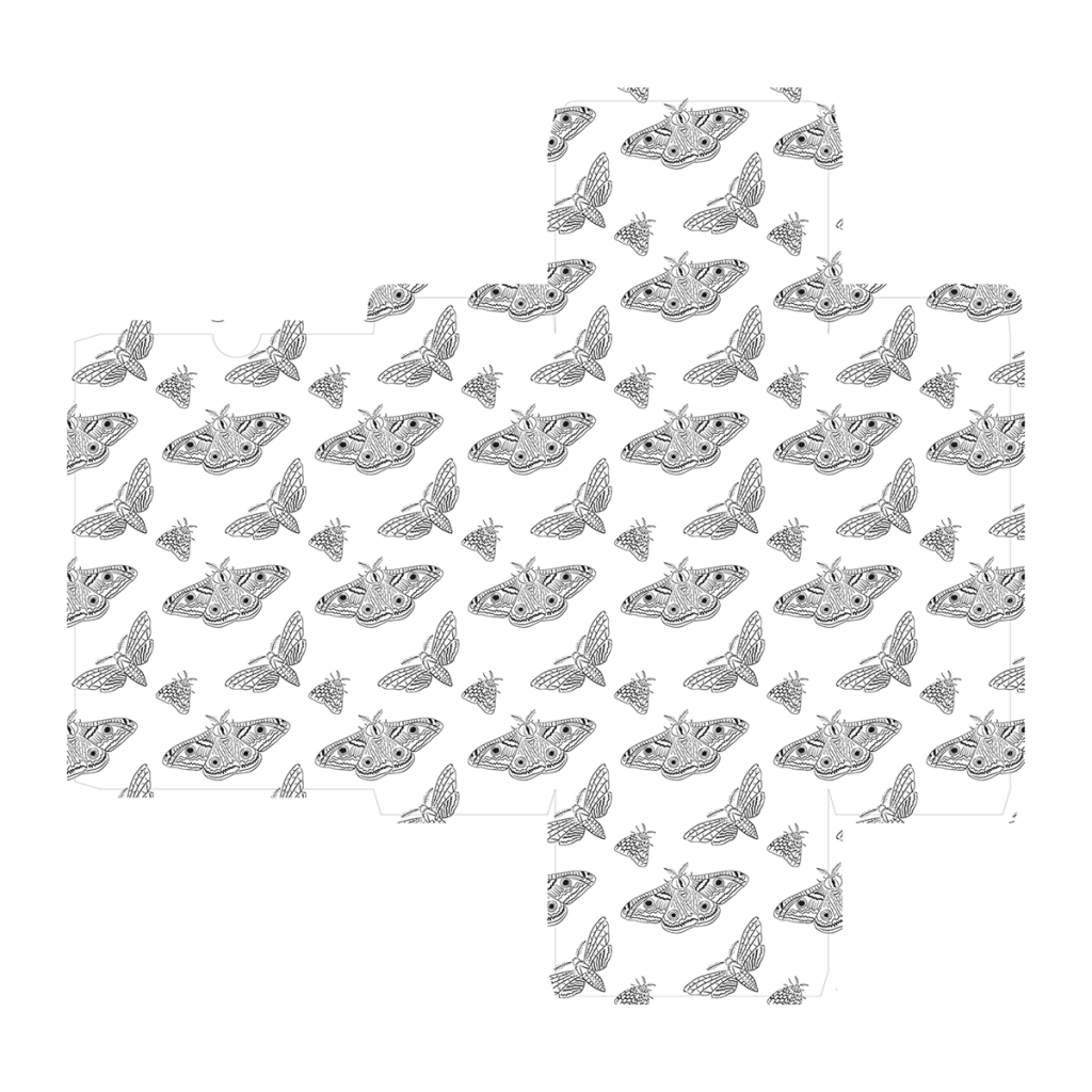
Ok so terrifying might be a slight exaggeration, but this certainly is a ‘classier’ take on Halloween packaging with illustrations of a Skull teapot on a smoky / distressed backdrop. For those esteemed tea drinkers who love the Halloween season, but hate the tack – this is the perfect moth-y middle ground. Also, there is something very luxurious about a box printed on the inside too that contains an everyday item such as tea. Good work Twinings!
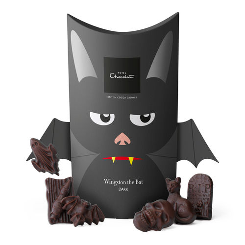
9. Na NaNaNaNaNaNaNa, Bat Pack…
Here at PPP, we love a good pillow pack. We also love puns. So ‘Wingston’ the Bat, a pillow pack containing Halloween moulded chocolate is a win win for us. Not only is this the cutest little bat pack we’ve ever seen, but we love how the graphic designer has made use of the corners of the pillow pack to make it appear as Wingstons pointy bat ears.
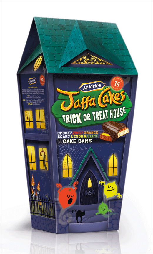
10. Jittery Jaffa Cakes
It really doesn’t take much to make anyone purchase Jaffa Cakes. As a nation, we love them. Jaffa Cake Bars though? You’ll have to convince us a little harder. In amongst Brexit talks, somewhere theres an ongoing discussion about whether a Jaffa Cake is indeed a cake, or a biscuit. Really riveting stuff.
Anyway, we’re guessing that those folk at McVities needed to sell a few more Jaffa Cake Bars when they came up with this coffin shaped box – and it really works. Although the design of the box isn’t anything new here, the graphic design has made the absolute most of it to make things appear 3D when they aren’t. Take that roof for example – does the window jut out of the packaging? Nope, it’s all an optical illusion.
It’s an exciting box that turns a little House of Horrors into a little box of wonders for all those Jaffa Cake connoisseurs out there.

